Layout 9: grid-template-areas
Pretty simple layout, but I like how the grid-template-areas gives plenty of white space for the text to have some breathing room.

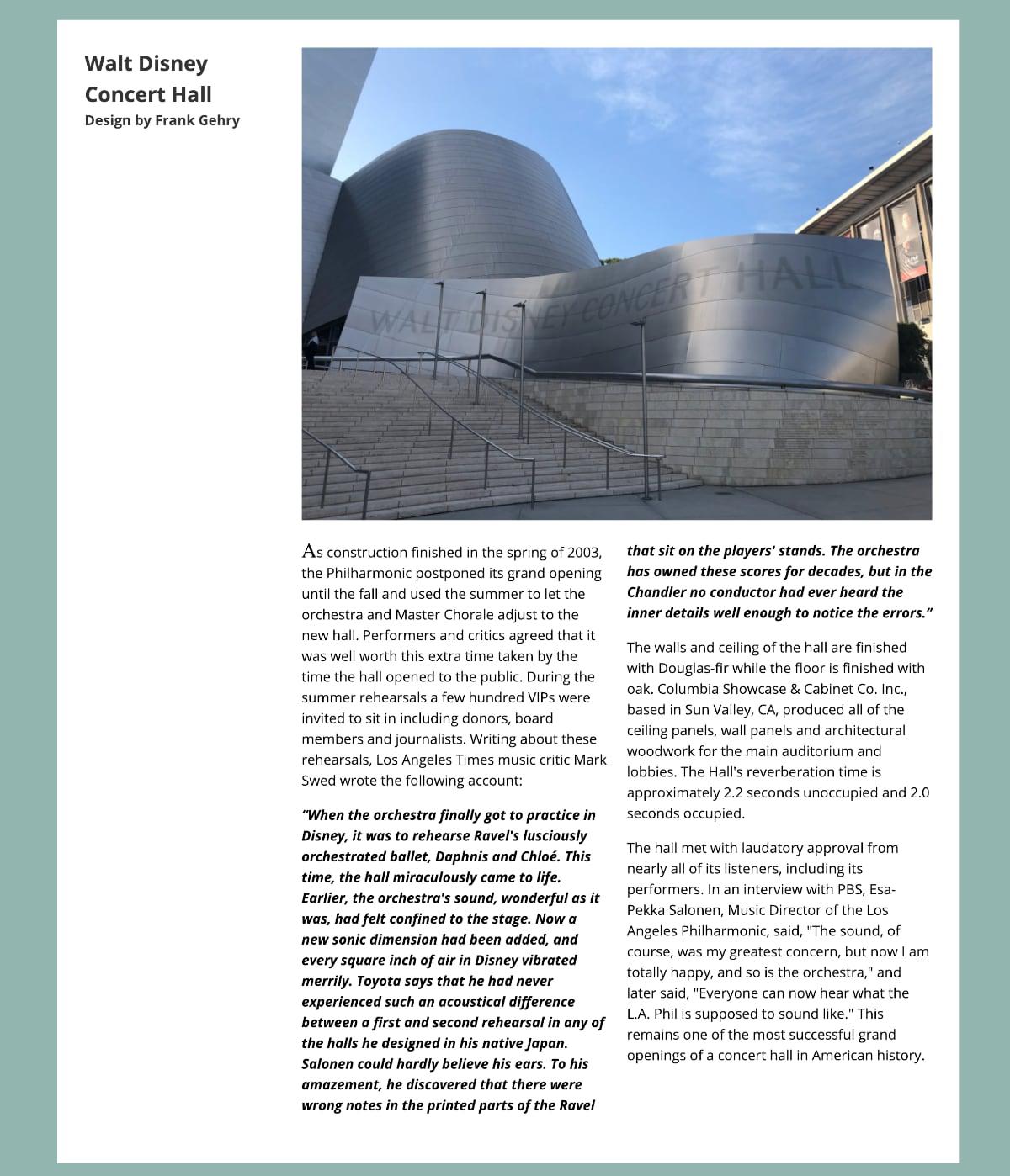
Walt Disney Hall
 article {
        background: white;
        display: grid;
        grid-template-columns: repeat(4, 1fr);
        grid-template-areas:
          "a img img img"
          ". x x x";
        grid-gap: 2vw;
        padding: 2em;
        margin: 2vh 5vw;
      }