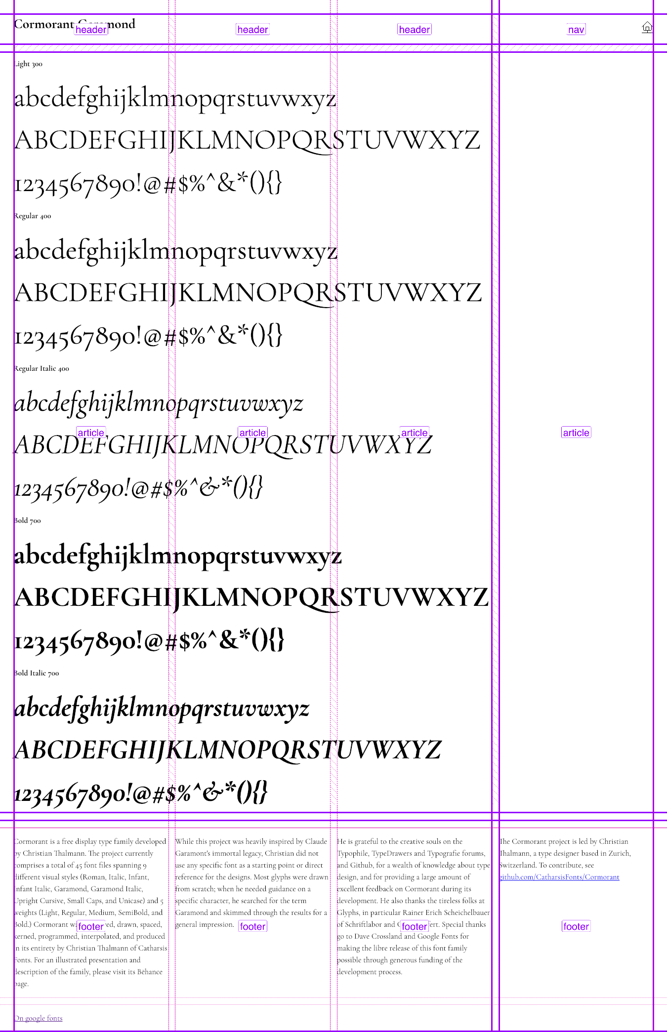
Layout 17: Cormorant Garamond typesheet
Working on a type sheet to test fonts in the browser. This first typesheet is the font Cormorant Garamond.

Working on a type sheet to test fonts in the browser. This first typesheet is the font Cormorant Garamond.
Cormorant is a free display type family developed by Christian Thalmann. The project currently comprises a total of 45 font files spanning 9 different visual styles (Roman, Italic, Infant, Infant Italic, Garamond, Garamond Italic, Upright Cursive, Small Caps, and Unicase) and 5 weights (Light, Regular, Medium, SemiBold, and Bold.) Cormorant was conceived, drawn, spaced, kerned, programmed, interpolated, and produced in its entirety by Christian Thalmann of Catharsis Fonts.
Links
- View the layout
- View the code on Github
- View the typesheet stylesheet
- Cormorant Garamond on Google fonts
CSS Code
The layout is made up of two grids. Rather than using multicol with media querries, I choose to use a second grid with minmax to set the width of the column across viewports.
body {
  font-family: var(--font-family);
  display: grid;
  grid-template-columns: repeat(auto-fit, minmax(300px, 1fr));
  grid-template-rows: repeat(4, 1fr);
  grid-template-areas:
    "nav"
    "header"
    "aside"
    "article"
    "footer";
  max-height: 100vh;
  margin: 2vw;
  grid-gap: 1vw;
}

@media (min-width: 37.5em) {
  body {
    grid-template-areas:
      "header header header nav"
      "article article article article"
      "footer footer footer footer";
  }
}

nav {
  grid-area: nav;
  justify-self: end;
}

header {
  grid-area: header;
}

header h1 {
  font-size: var(--font-size-x-large);
  font-weight: var(--font-weight-bold);
  margin: 0;
}

article {
  grid-area: article;
  overflow-wrap: break-word;
}

article h2 {
  font-size: var(--font-size);
  font-weight: var(--font-weight-bold);
}

footer {
  border-top: var(--border-width-hairline) solid var(--color-border-separator);
  grid-area: footer;
  margin-top: var(--spacing-medium);
}

footer {
  display: grid;
  grid-template-columns: repeat(auto-fit, minmax(300px, 1fr));
  grid-gap: 1vw;
}