08 Notes
Bodoni was Brodovitch’s typeface of choice. This story featured a special insert on hand-made Italian paper reproducing four pages from Bodoni’s eighteenth-century books.
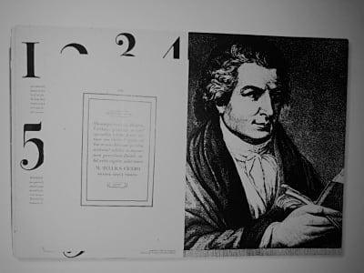
Giambattista Bodoni first took the type-designs of Pierre Simon Fournier as his exemplars, but afterwards became an admirer of the more modelled types of John Baskerville; and he and Firmin Didot evolved a style of type called “Modern,” in which the letters are cut in such a way as to produce a strong contrast between the thick and thin parts of their body. Bodoni designed many typefaces, each one in a large range of type sizes. He is even more admired as a compositor than as a type designer, as the large range of sizes which he cut enabled him to compose his pages with the greatest possible subtlety of spacing. Like Baskerville, he sets off his texts with wide margins and uses little or no illustrations or decorations.
One of Bodoni first tasks at the press of the Sacra Congregatio de Propaganda Fide (The Congregation for the Evangelization of Peoples) was sorting and cleaning punches in a wide variety of Middle Eastern and Asian languages. Bodoni quickly demonstrated his gift for exotic languages and, as a result, he was sent to study Hebrew and Arabic at “La Sapienza,” (Sapienza University of Rome). Bodoni soon became the press's compositor of foreign languages, and began to typeset books. He then began cutting his own punches.
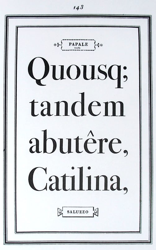
Bodoni was Brodovitch’s typeface of choice. This story featured a special insert on hand-made Italian paper reproducing four pages from Bodoni’s eighteenth-century books.