Soul of a nation
Inspired layout from exhibition of Art in the Age of Black Power
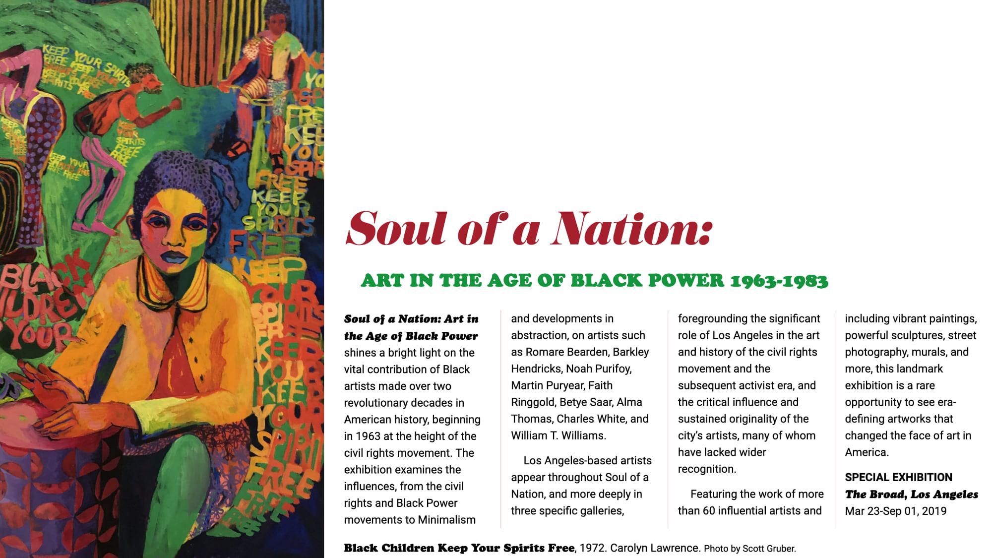
I really like how this layout turned out.
My favorite addition is use of object-position: right top to improve the focal point of the painting. Instead of showing the default object-fit: cover I could choose where to position the img. I think it helped create a more appropriate crop and increase the dramatic effect. I think we should all be thinking how to use object-position more often in our art-directed layouts.
I also like how the display fonts Cooper Black and Eloquent JF fonts turned out. Definitely adds some funk to the layout. Of course multi-column to make it like a magazine layout and the grid is based on Andy Clarke's compound grids I learned from his Inspired Design Decisions webinar series on smashing magazine.
Here is a link to the layout online.
And some code snippets.
article {
display: grid;
grid-column-gap: 2vw;
grid-template-columns: 2fr 1fr 1fr 2fr 2fr 1fr 1fr 2fr;
margin: 0;
}

img {
grid-column: 1 / 4;
grid-row: 1 / 5;
height: 100vh;
object-fit: cover;
object-position: right top;
width: 100%;
}

div {
column-count: 4;
column-gap: 2vw;
column-rule: 1px solid hsla(358, 76%, 38%, 0.2);
column-width: 10em;
grid-column: 4 / -1;
grid-row: 3;
margin-bottom: 1em;
}
And here's the code on github to check out if that's your thing.