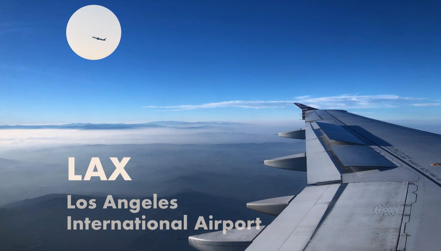
Layout 1: Flying into LAX
This is the first layout from my 100 layouts project.

This is the first layout from my 100 layouts project. As background, 100 Layouts is my side project to create 100 designs to study layouts and typography. Most pages use photos of Los Angeles and include some of my favorite locations. I like to call it an ethnographic love story for LA. All layouts use CSS grid.
This layout is made up for two photos. The main photo was taken from the window seat flying down from San Francisco on approach to Los Angeles. The plane in the moon is from a snapshot I took when I landed at LAX.
CSS
Below is the CSS I used for this layout.
<style type="text/css">
body {
  font-family: Futura, sans-serif;
  display: grid;
  grid-template-columns: 200px repeat(3, 1fr);
  grid-template-rows: repeat(4, 1fr);
  grid-gap: 1em;
  margin: 0;
  max-height: 100vh;
}

.plane {
  grid-column: 1 / -1;
  grid-row: 1 / 5;
  z-index: 1;
}

.plane img {
  width: 100%;
  height: 100%;
}

.moon {
  margin-top: 20px;
  grid-row: 1;
  grid-column: 2;
  z-index: 2;
}

.lax {
  color: hsl(30, 60%, 91%);
  font-weight: var(--font-weight-black);
  grid-row: 3;
  grid-column: 2 / 4;
  z-index: 2;
}

h1 {
  font-size: var(--font-size-xxx-display);
  margin: 2em 0 0 0;

}

.la, .airport {
  color: hsla(30, 60%, 91%, .7);
  font-size: var(--font-size-display);
  display: block;
  margin: 0;
  padding: 0;
  line-height: 1.2;
}

</style>