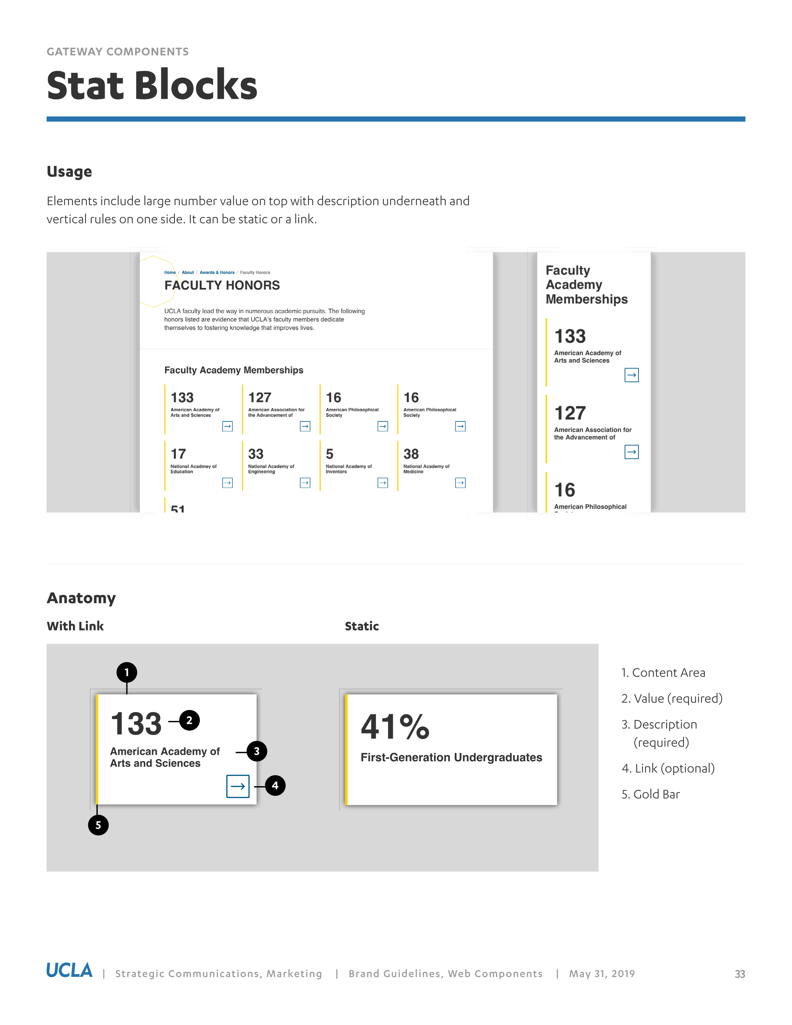
Coding a stats component
Overview of my approach to code a stats component for the Institute of the Environment and Sustainability's website based on the UCLA brand guidelines for the web.

I use it as a prototyping tool and reference for when I code the UCLA Institute of the Environment and Sustainability’s site.
I'm working with a few colleagues from across campus to make a bespoke UCLA design system designed to fit in the Bruin culture. This is a marathon not a sprint and so we take our time and talk through questions and issues with like minded designers and developers.
To me, the guidelines inspire creativity and embrace diversity. A brand doesn't mean we all look the same, but that we aspire to the adopt core values of excellance and inclusivity. The guidelines provides design constraints, so everyone starts from the same font family, color palette and logo lockup. How these design elements are arranged can and should vary. To developers this means there isn't one standard. Technology changes to quickly and there are too many use cases to only use one tool. We need to have multiple tools in our tool kit. Whatever technologies are in use around the world, someone is sure to be using it at UCLA. That’s ok by me. I do think we have an opportunity to build a design system that can support this diversity and that is simple by design.
For a living design system at UCLA I think it should be platform agnostic. I'm advocating that we create UCLA specific names. Names could be inspired from Bruin history and now that we're celebrating our centinnial seems a good time to begin. Over the next year or two we can create our own unique framework.
This post covers how my solution to building one component from the guidelines. I started from a shared a scss file for a stats block and I went from there.
I added a ucla-c prefix to namespace the component.
Previously I added to the starter kit a modular scale for Helvetica, a color palette in multiple formats (hex, RGB and HSL as SCSS variables and CSS Custom Properties). I’ve recently added the first component called a stats block. I’ve only supplied my HTML and CSS, but on the IoES WordPress site I help our creative content editors by build simple data entry fields using the advanced custom fields. I held back the CMS code because there are many content creating systems (a new term for content management system) across campus and each developer can adapt the component as they see fit.
The original scss file wasn’t named spaced ucla-c- and I took creative license to rename the class names and change css properties that had floats and px measures to fit the previous work I did based the CSS. In this post I include version one of the html and css along with my adaptions. I think we should adopt a name space unique for UCLA.
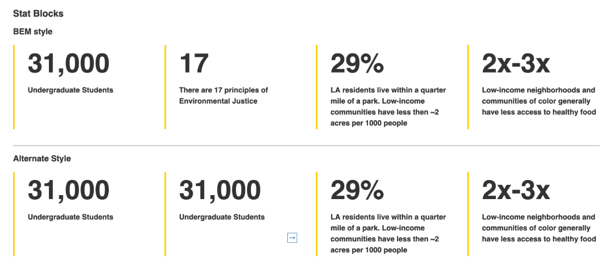
Of course there are many ways to code this block. My approach is only one solution. I prefer to use flex box and css grid and keep my markup concise. I didn’t want to deviate far from the original code shared so in a simple starter kit for UCLA sites, I posted two sample solutions. One uses BEM for the CSS with several HTML variations. The second example is my preferred solution to test and discuss with developers before implementation. I also share some links from the W3C spec and sample solutions from frameworks currently in fashion.
Example One
The first example uses BEM, <div>s and <span>s with several markup solutions and two ways to code the CSS.
HTML approach #1
<div class="ucla-c-stat-wrapper clearfix">
<div class="ucla-c-stat-tout">
<span class="ucla-c-stat-tout__number">31,000</span>
<span class="ucla-c-stat-tout__label">Undergraduate Students</span>
</div>
</div>
HTML approach #2
<div class="ucla-c-stat-wrapper">
<figure class="ucla-c-stat-tout">
<span class="ucla-c-stat-tout__number">31,000</span>
<figcaption class="ucla-c-stat-tout__label">Undergraduate Students</figcaption>
</figure>
</div>
HTML approach #3
<div class="ucla-c-stat-wrapper">
<p class="ucla-c-stat-tout">
<span class="ucla-c-stat-tout__number">31,000</span>
<span class="ucla-c-stat-tout__label">Undergraduate Students</span>  </p>
  </div>
CSS
CSS approach #1 uses floats.
.stat-wrapper {
    .stat-tout {
        border-bottom: 4px solid $gold;
        padding-bottom:24px;
        margin-bottom:48px;

        // .number and .label are spans
        &__number {
            font-size:4rem;
            line-height:4rem;
            color: $grey-80;
            font-weight:bold;
            display:block;
            margin-bottom:8px;
        }
        &__label {
            font-size:1rem;
            line-height:1.25rem;
            font-weight:bold;
            display:block;
        }
      @media only screen and (min-width: breakpoint-min(md)) {
            width:calc( (100%/2) - (24px/2) ) ;
            float:left;
            margin-right:24px;
            &:nth-child(2n) {
                margin-right:0;
            }
        }
        @media only screen and (min-width: breakpoint-min(lg)) {
            width:calc( (100%/3) - (48px/3) );
            float:left;
            margin-right:24px;
            &:nth-child(2n) {
                margin-right:24px;
            }
            &:nth-child(3n) {
                margin-right:0;
            }
        }
    }
}
CSS approach #2
Uses Flexbox and CSS grid
.ucla-c-stat-wrapper {
  display: grid;
  grid-template-columns: repeat(auto-fit, minmax(300px, 1fr));
  grid-gap: 2vw;

  .ucla-c-stat-tout {
    display: flex;
    flex-direction: column;
    border-left: var(--ucla-border-thick-gold);
    font-weight: var(--ucla-font-weight-bold);
    line-height: var(--ucla-line-height-text);
    margin-bottom: var(--ucla-spacing-xx-large);
    @media screen and (min-width: $ucla-bp-medium) {
      margin-bottom: var(--ucla-spacing-x-large);
    }

    &__number,
    &__label {
      margin-left: var(--ucla-spacing-x-large);
    }

    // .number and .label are spans
    &__number {
      font-size: var(--ucla-font-size-xxx-display);
      color: $ucla-black-80;
    }

    &__label {
      font-size: var(--ucla-font-size-medium);
    }
  }
}
Example Two
A simpler solution uses one <div> and a single class name .ucla-c-stat-block. The <figure> wraps the number or metric and <figcaption> for the label and an optional link. The look remains the same as sample 1 which uses BEM, but I think is easier to understand and has better semantics.
HTML
<div class="ucla-c-stat-block">
<figure>
31,000
<figcaption>Undergraduate Students</figcaption>
</figure>
</div>
.ucla-c-stat-block {
display: grid;
grid-template-columns: repeat(auto-fit, minmax(300px, 1fr));
grid-gap: 2vw;
figure {
display: flex;
flex-direction: column;
font-size: var(--ucla-font-size-xxx-display);
font-weight: var(--ucla-font-weight-bold);
border-left: var(--ucla-border-thick-gold);
padding-left: var(--ucla-spacing-x-large);
margin-bottom: var(--ucla-spacing-xx-large);
@media screen and (min-width: $ucla-bp-medium) {
margin-bottom: var(--ucla-spacing-x-large);
}
figcaption {
font-size: var(--ucla-font-size-medium);
}
}
}Using figure and figcaption
I decided to use a <figure> and <figcaption> because the stat value is illustrative and the description provides further explanation. It appears in the flow of a page but could be moved away from the main flow. This follows the spec defining what the <figure> tag can be used for.
From the W3C spec
The figure element represents a unit of content, optionally with a caption, that is self-contained, that is typically referenced as a single unit from the main flow of the document, and that can be moved away from the main flow of the document without affecting the document’s meaning.
Richard Clarke wrote about it on html5doctor.com back in 2010.
The
<figcaption>element is optional and can appear before or after the content within the<figure>.
No need to constrain your
<figure>to images and code examples. Other content suitable for use in<figure>includes audio, video, charts (perhaps using<canvas>or<svg>), poems, or tables of statistics.
And from Mozilla Developer Network
Usually a
<figure>is an image, illustration, diagram, code snippet, etc., that is referenced in the main flow of a document, but that can be moved to another part of the document or to an appendix without affecting the main flow.
Another bit of interesting information about the figure element comes from HTML The Living Standard on whatwg.org
Finally, here are the typical default display properties for <figure> and <figcaption>.
figure {
display: block;
margin-before: 1em;
margin-after: 1em;
margin-start: 40px;
margin-end: 40px; }

figcaption {
display: block;
}
Examples from Bootstrap, Foundation and Semantic UI.
Stats are fairly common on the web and most often used in dashboards and pricing tables. I haven’t found any definitive solution and provide samples and links here for further research and comparison.
Bootstrap
Closest thing in bootstrap to a stat component that I found was a pricing card. Bootstrap used <h1> on the number value. I'd rather use a heading or paragraph tag than divisions and spans to provide some semantic meaning.
<div class="card-deck mb-3 text-center">
    <div class="card mb-4 shadow-sm">
      <div class="card-header">
        <h4 class="my-0 font-weight-normal">Free</h4>
      </div>
      <div class="card-body">
        <h1 class="card-title pricing-card-title">$0 <small class="text-muted">/ mo</small></h1>
        <ul class="list-unstyled mt-3 mb-4">
          <li>10 users included</li>
          <li>2 GB of storage</li>
          <li>Email support</li>
          <li>Help center access</li>
        </ul>
        <button type="button" class="btn btn-lg btn-block btn-outline-primary">Sign up for free</button>
      </div>
Foundation
Uses class names on <div>, <span> and <p> tags with class names that are descriptive but only if you see the code.
<div class="card-profile-stats-container">
    <div class="card-profile-stats-statistic">
      <span class="stat">25</span>
      <p>posts</p>
    </div> <!-- /.card-profile-stats-statistic -->
    <div class="card-profile-stats-statistic">
      <span class="stat">125</span>
      <p>followers</p>
    </div> <!-- /.card-profile-stats-statistic -->
    <div class="card-profile-stats-statistic">
      <span class="stat">88</span>
      <p>likes</p>
    </div> <!-- /.card-profile-stats-statistic -->
  </div> <!-- /.card-profile-stats-container -->
Semantic UI
Semantic UI has a statistic block which uses <div> on the number value and label. Again, the class names don't help with semantics.
<div class="ui statistic">
  <div class="value">
    5,550
  </div>
  <div class="label">
    Downloads
  </div>
</div>
Links
Conclusion
I think using a single class name on the parent of a component and style child elements is an elegant solution that keeps my markup simple and offers a nice balance of global and local effects.
What do you think? Let me know on twitter